A proper category page should help your visitor to choose. This sounds obvious, but most category pages are a disaster. Yes, yours too. What info should and should not be listed? And how do you know what info your user is looking for? Let’s dive into what makes a category page good. Or bad.
Category pages should help your visitors find what they need
A category page or overview page is a page where similar products or services are listed. For an e-shop, for example, it will show all televisions on sale. For a telecom operator, it’s an overview of all subscription models they offer.
These overview pages should help your visitors (=your prospects) to find the best solution or product for them.
Unfortunately, most websites are not helpful at all. They just list all the products and let the visitor do all the work.
That is a terrible attitude.
Imagine this: you walk into a store to buy a new TV. A salesperson takes you to the section with all the TVs. And then he waves goodbye, wishing you good luck.
He doesn’t give you any advice, doesn’t tell you any specifications.
Just… leaves you there.
I’m pretty sure you won’t buy your new TV in that store.
Unfortunately, this is exactly what many category pages do: they give you an overview of products, with no extra help.
Well, I’ve got news for you.
Online, your category page is your salesperson.
Ready to make your category page rock?
Watch our video. If you prefer text, read our do’s and don’ts below the video.
Not so helpful: Novy’s overview page
A few years ago, my friend Karl was looking for an induction cooking hob. He visited Novy.be and got this category page.
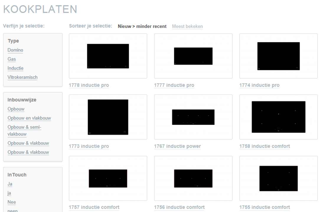
This is a perfect example of a terrible category page:
- Lousy product shots
No, these images are not broken. If you look closely, you can see they real. But lousy. - No product information
The only information that’s shown is the product number. Woohoo!
Do you choose your cooking hob by product number?
Well, Karl does not.
Like most of us, he wants to know:
- Whether it will fit into his kitchen (size)
- How many cooking zones it has
- How much it will cost (price)
These are what we like to call the main decision criteria for a product.
Don’t force your prospects to click on every product
Novy’s category page forces visitors to click on every single product to find out the details. Only then, they can decide if this is the product the’re looking for.
Or not.
Of course, that’s time-consuming. And so frustrating that visitors will leave your site.
Bye potential customer! Bye sale!
And all this because you are too lazy to help your visitors.
State which solutions are suitable for your client, and which are not.
Help your prospects by giving them the most important decision criteria.
By doing this, you’re not just guiding them through your website. You’re guiding them towards a sale.
Currys: actual helpful info!
Let’s compare the category page of Novy to Currys.
When you look at the product overview, you get a lot more information.
Aside from better pictures, Currys shows some actual info for each product:
- Price
- Width
- Number of cooking zones
- Whether you can install it yourself, or by a professional
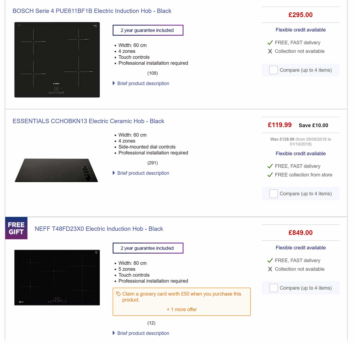
Notice how all characteristics are listed in the same order?
This makes it easy to compare and helps you to make a choice.
Novy’s new website is not much better
Novy’s category page dates from a few years back. They recently redesigned their website completely.
Sadly, not for the better.
They redesigned the site to make it look prettier. The outer layer has changed, but the core of the problem is not solved.
This happens often with redesigns and is one of the biggest problem when you follow design trends. A new layer of varnish will not help your site. A site is something that’s being used. Not something just to look at.
(Read our tips on how to do a succesful redesign.)
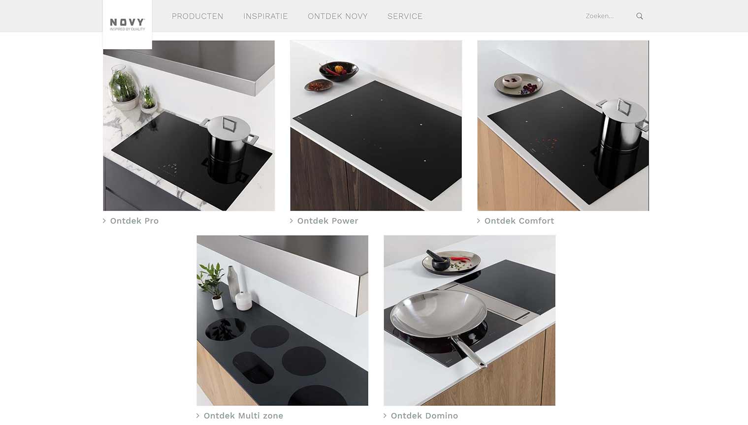
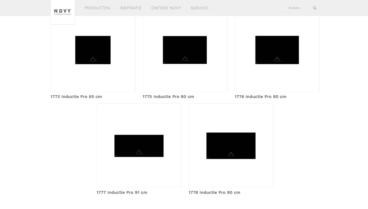
I think the new Novy website is even worse than the old one.
They now start from their own point of view: visitors need to choose between product lines first. Because, of course, every visitor knows those product lines. NOT!
On a category page more is often better
I know I often say less is more. But sometimes more is better.
When user testing and targeted surveys reveal that your customers have different decision criteria, just show all of them.
Remember: it’s about your client’s criteria! Not about what you think is important.
Oh yes, we often discover a huge gap between what companies believe to be the main decision criteria of their target audience, and the decision criteria of that target audience. So please: do your user research instead of a brainstorm.
Case study: AB-test for Suzuki
On this overview page of four-wheel drives by Suzuki, there was some decision criteria:
- Number of doors (something we discovered a long time ago when doing research for Renault)
- Price
- Co2 emissions
- Fuel consumption
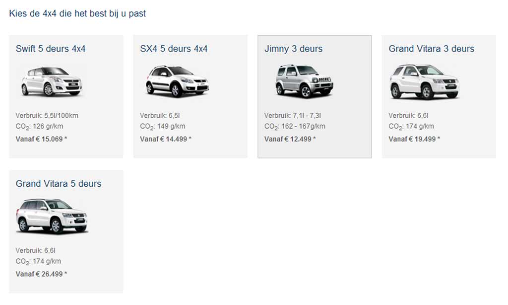
However, our user research revealed there were 2 decision criteria that were way more important:
- Diesel or petrol
- Manual transmission or automatic
We added this information to a variation of the category page and AB-tested it.
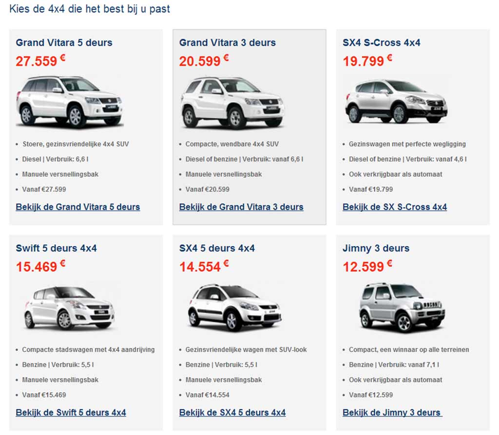
The result?
The new page seduced 22% more visitors to go to a product detail page.
And that resulted in a big increase in requests for an offer, and test drive bookings.
Because this new page helps visitors to find the model that suits them the best.
So, what information should you list on your category page?
It depends.
The guideline is easy: show the right decision criteria so your prospects are able to make 70 to 80 % of their decision on the category page.
The difficult thing is: what are those criteria for your product, your audience and your brand?
To discover that, you will have to do user research.
Not sure how that works?
Dive into user research with our online training on user research.
In a nutshell: 5 pieces of advice for your category page
- Make sure your visitors can make 70 to 80% of their choice because you show them the right decision criteria.
- Understand that what’s important to you, may not be relevant to your clients. That’s why you should investigate what the explicit and implicit decision criteria of your target audience are.
- These criteria can vary significantly, depending on your target audience. Someone looking for a BMW will have different criteria for their choice than someone looking for a Suzuki.
That’s why you need to do user research. - Make comparison easy by listing the same essentials for each product, in the same order. Optionally, you can add 1 or 2 more unique specifications.
- Test your new category page! Does it result in higher conversion rates? Conversion optimization is not just guessing. It’s optimizing your site step by step, based on processes.

Leave a Reply