It’s that time of year again: we’re being spammed with the newest design and UX trends. People love writing those articles. And apparently, people like reading them too. But do you realize that most trends don’t make any difference? That they won’t help you sell more? On the contrary: they might actually damage your leads and sales.
The nonsense people publish under the pretext of ‘new trends’… It makes me itch, every year. Especially when it comes to UX and web design, because a lot of those trends go against the core principle of UX and usability.
Core principle of interface design: intuitiveness
When we talk about interface design for websites, there’s only 1 thing that matters: make something your target group can use without any effort.
Something that is so easy to use that your users simply forget there even is an interface. Recognizability is key here. Check out this article on affordance to find out more.
A website is not made just to look at
Which does not mean looks are irrelevant. On the contrary.
And of course, your website can be beautiful. We even recommend this as usability people. Because when your visitors think something is beautiful, they are more forgiving towards small usability issues. This is called the Aesthetic-Usability Effect. Which helps to explain at least in part the success of companies like Apple, in my opinion.
But you have to realize that in the end, a website is not made just to look at.

A website exists to be used.
And that’s where it often goes wrong.
There are still many designers, web agencies and marketers who believe that web design should be visually impressive. Or that, at the very least, it should stand out.
And in that quest for visually impressive or unique design, we tend to forget about the core principle: instant usability.
And that’s a shame. Because whichever way you look at it, in the end, your website is made to seduce visitors and to sell. Directly or indirectly.
An example: which Carglass homepage leads to more appointments?
Which of these 2 homepage versions works best? Good to know: ‘making an appointment’ is the number 1 top task. Over 65% of the visitors come to the Carglass website to make an appointment. That’s what we learned from our top task survey.

So, what do you think?
When I show this example at conferences, over 95% of the people usually vote for the version with very little copy.
Because it’s visually more appealing and at first sight, seems to have more focus.
The actual users disagree.
The more content-rich version results in more appointments. Because the copy answers the most important questions and doubts the visitors have.
How do we know what their doubts and fears are? We found out by doing the in-depth user research we always do before we come up with conversion optimization ideas.
Design trends hardly ever make a difference
Most website design trends mean nothing for your sales or revenue. Because they’re not based on your visitors’ needs. And definitely not on business needs.
Or do you really believe you will sell more by giving your call-to-action button rounded corners instead of square ones?
Or by using bright colors, or duotones? Instead of the pastel shades that were in fashion a couple of years ago?
Although of course, it’s best to use black flame or heart wood, according to this (Dutch) blog article.

Who believes this rubbish anyway?
The effect of copy changes is 5 times greater than design changes
Believe me. We’ve tested a ton of these web design trends. Most of the time, they don’t make any difference.
Because it’s just a layer of varnish. And that doesn’t change anything about the intention or the behavior of your visitors.
Just so I’m absolutely clear: I’m not saying that design is nothing more than a layer of varnish. But these design trends definitely are.
If we look at all of the A/B tests we’ve done in the past 3 years, we see that changes related to copy and psychology result in an impact that is up to 5 times bigger than the impact of design changes. (For your information: we work with brands like Yoast, Carglass, Suzuki, Samsonite, Microsoft and Barco.)
I repeat: when we change the content of a page based on our user research and our knowledge of behavioral psychology, the impact is 5 times greater than when we change the design.
In case you missed it … that was a compliment for every designer reading this. Because what I’m actually saying is that the average website these days has a pretty okay design. Content changes only have a big impact if the original design stinks.
Some design trends cost you money. A lot of money.
Below you can find some of the website trends of the past years of which we know they harm your sales, number of leads and conversion rate. Not only are these trends expensive to implement. They are losing you money on top of that.
- Carousels or sliders
We already put it in our Belgian Web Usability Report in 2002: sliders suck. Since then, this has been confirmed in countless A/B tests, such as this one for Suzuki. Dozens of articles have been written on this topic. And still, 1 out of 3 websites has a carousel. - Video backgrounds
Video backgrounds are the new sliders. They distract the visitor from what a site is really about.
That’s why you don’t see them on the websites of real top companies such as Google, Booking.com, Airbnb, Zalando or Coolblue.Karl ranting about background videos. Never gets old. @AGConsult at #gms17 pic.twitter.com/sUt9eC1NW5
— Liesa Carton (@KartonLiesa) August 31, 2017
- Full-screen videos
A trend, according to this article.
Let’s hope they’re wrong. For our few clients who had full-screen videos, we got amazing results just by killing them. (The videos, not the clients.)
Look at the impact on scrolling behavior, just by leaving out the full-screen video. - Ghost buttons
Don’t get me started on these. Read why they don’t work and look at the research and numbers about the difference with a real button. And have you heard? According to some trendwatchers, the drop shadows will be back this year. Oh, the irony.
Invest in what matters: your content
Unless your web design defies the core principles of usability, it’s a better idea to work on your content. It will have a lot more impact than blindly following the latest design trends.
Updating the way your site looks rarely has an impact. Because looks are not the main issue anymore.
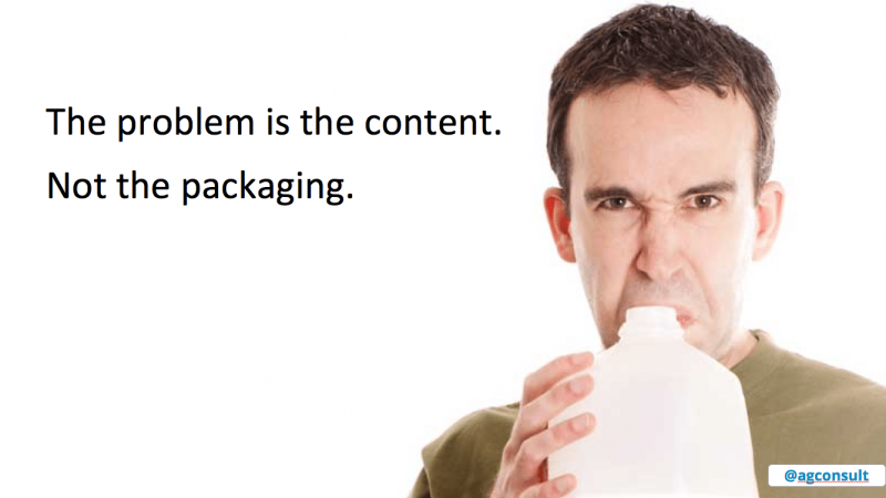
If you have spoiled milk in your fridge, there’s no point in pouring it into a new carton with pretty packaging.
You need to replace the milk.

The biggest problem is the content, not the container. Most companies, non-profit organizations and governments don’t get this.
What is stopping you from getting those high conversion rates, good usability and more online success is not the form, but the content.
What is stopping you from getting higher conversion rates, a better usability and more online success is not the form, but the content.
Yep, It’s because of your content and the way you word your messages, that your visitors can’t find what they’re looking for. It’s what stops them from taking action, and what makes them check out your competition.
My advice: ignore design trends.
Focus a little less on the form. Focus more on your content and your visitor.
Re-write your copy, for starters. Or invest in conversion optimization based on user research.
That way you can really change your visitors’ behavior.
So they make more appointments on your website. Or ask for more quotes. Or buy your products.
And by fixing your content and message, you’re getting ready for the one next trend that does matter: speech interfaces.

Awesome article! Website designs shouldn’t go by trends, rather on the personality of the brand in question. You have specified a lot of trendy things and the actual implications of using them, which I find wonderful. Content is absolutely what brings back a reader to the website in the first place, and that has to be top-notch.