Faceted search: when and why?
Faceted search helps people to look for things based on criteria that are important for them. In classic web navigation, the website determines the order of the choices. But this hierarchical structure is too limited for sites with a large product range or information offering. Different people often have different criteria in searching for the same thing.
Example: holiday homes
When I’m looking for a holiday home, a swimming pool is essential. For you it might be that pets are allowed or that it’s no more than 10 miles from a supermarket.
All these things are important, but they’re not important for everyone. The best way to solve this: faceted search.
Sure, you could also go for an extremely advanced search feature, but I’d advise against it.
In this article we’ll discuss 4 design aspects of faceted search that are crucial for good usability.
Where do you put faceted search?
- Left is best
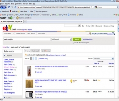
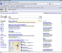
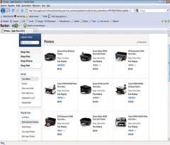
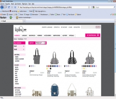
Big sites like Amazon, eBay and Google put faceted search on the left. These sites probably have more visitors than you do.When big, influential sites do things a certain way, that creates a certain pattern of expectation for users. They expect you to do things the same way those big sites do it.Another compelling argument for putting faceted search on the left is that the left half of the page gets more attention than the right half. If you want your filters to be noticed and used, put them on the left. Apple does it too, on their website and in iTunes.

- Second-best: at the top
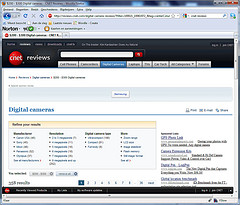
You can put faceted search at the top, but it’s not as good as left. Mainly because it pushes everything on the page down. Which means less of your products are visible above the page fold. And even though people definitely scroll, they spend 80% of their time above the page fold.In the Cnet example, the search filters push the reviews below the page fold. Not good.
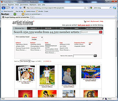
- Stay away from the right
During our own user tests we often see that faceted search on the right side of the page is ignored by about half of the test users. People don’t look at the right side of the page very much, not even when you put the search filters there.
How do you indicate which filters are active?
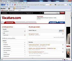
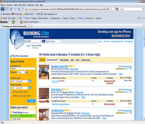
- In the search filters themselves The best way to indicate which search filters are active is by making them stand out visually. Just like you’d do in a standard navigation (read tip 4 of our article on way-finding).Downside: if you have a lot of search filters, it can become difficult for the user to see all the active filters. Apple indicates which filters are active in a very clean and clear way. Booking.com looks slightly less refined but it is very clear.


- In a separate area above the search filters
Probably the way most sites do it now. The advantage is that users get a quick overview of all the active filters. The downside is that the actual search filters get bumped down a little.
- At the top of the page
Less popular but also possible. Put a sentence ‘x products for your search criteria:’ followed by the active filters. Put a red cross behind each filter to make it clear the user can undo his choice.This is especially handy if you have lots of search filters. Less experienced users understand how this works too.
How to undo a filter choice?
-

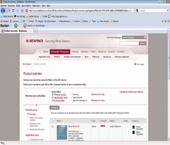
Add an ‘undo’ x in the active filter A very clean-looking way that takes up a minimal amount of screen space.
-
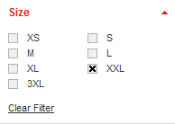
By adding a link ‘Clear filter’ to every filter category
It works, but it sounds a bit technical and it’s quite clunky. Downside: it takes up one extra line. In this case it’s also quite unnecessary because it’s a system with check-boxes.
-
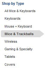
By adding an item ‘All …’ to every filter category
It’s not the most elegant solution but we’ve seen in user testing this works really well. Downside: it takes up one extra line. - In the active filters summary
Simply put a red cross behind every active filter if you put the active filters together at the top of the filter list or at the top of the page.
What if you want to allow more than one active filter within the same category?
- Check whether it’s really beneficial for the user.
- If it is, put checkboxes in front of the filters. That makes it clear users can select more than one item in the same filter category.
If you know any particularly good examples of faceted search, please share them in the comments!

If you allow more than one active filter from a category, should it be an OR or an AND statement? For example, if “chocolate” and “vanilla” are both checked, should the results show items containing both flavors (chocolate/vanilla swirl, perhaps) or should it show all chocolate and all vanilla items?
It really could go either way. I would be more likely to want “adolescent, health, AND policy” than the nonsensical “2-megapixel AND 5-megapixel”. But if I wanted to find “adolescent health policy” items then it would be frustrating if each result only matched one of the terms.
Hi Lee,
It’s important to remember that filtered navigation isn’t always a good idea.
I can’t really see a type of site where more information about ‘adolescent health policy’ is to be achieved through filtering.
Also, choosing which filters are handy and where you should be able to combine more than one filter within the same category is important.
I would say a combination of filters within the same category ideally means ‘AND’ rather than ‘OR’. In your chocolate/vanilla example I would say all chocolate items and all vanilla items. In my logic, the chocolate/vanilla swirl would also appear if you have chosen either chocolate or vanilla. Unless there’s a ‘Combined flavours/Flavour swirl’ option. 🙂 Yoox.com for example allows people to select multiple designers, sizes and colours. That wouldn’t make sense if it was ‘OR’.
In general, within a category, if all the boxes are checked is that semantically equivalent to having none of the boxes checked? (Assuming every item has at least one value for that category).
You could also have an “all” radio button checked that indicates that all the choices are active as default without x’ing up all the boxes at first. Then, with the first box checked, the “all” button becomes unchecked, and checks start taking hold. If the last box is checked, the “all” button becomes active, and the boxes are unchecked.