Your homepage is not always the first page people see. Lots of visitors find your site via Google and immediately end up on a detail page. Or maybe they’ve clicked a link on another website. A link that doesn’t necessarily mention your website’s name.
Letting people know which site they’re on and where they are on that site is pretty basic usability stuff, but that doesn’t mean it isn’t important.
1. Logo and company name in top left corner
Put your logo in the top left corner. If your logo doesn’t contain your company name, put your name directly underneath the logo. Do this on every page. That way, people immediately know whose website they’re on.
Don’t think putting your logo on the right side will make you special. Sure, you’ll be different, but not in a way people appreciate. You’re just making it harder for them to know which website they’re on.

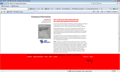
Ogilvy puts its logo in the bottom right corner. Because that’s not where people expect it to be, it will take them longer to see it. Not mentioning your name or logo at all is of course not the greatest idea either.

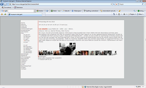
Without a logo or name in the top left corner, it’s not easy for visitors to know they’re on the website of the Museum for Industrial Archeology and Textile (MIAT) in Ghent.
2. Breadcrumb
A great way to let users know where they are on your website, is via a breadcrumb. A breadcrumb shows you where you are on a website by visualizing the site’s hierarchy, from the homepage to the current page. You can find more details on what a good breadcrumb looks like in our article ‘Breadcrumb: 7 tips’.
3. Clearly visible page title
A page title has to stand out. Use a larger font size and perhaps even a different colour than your regular text colour. Put the page title always in the same, clearly visible place: at the top of the content part of the page, left-aligned. Use the same term as the one you use in your menu, or at least start the page title in the same way. Inconsistencies can be confusing.

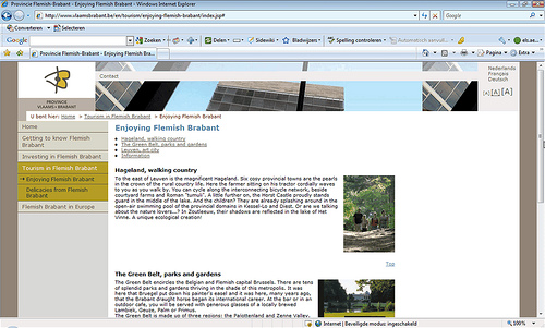
The Belgian province Flemish Brabant puts the page title or header where it should be: at the top left of the page’s content part, in a larger font size and different colour than the regular text.
4. Navigation: active item in a different colour
Navigation plays a very important part in telling people where they are on a website. An easy way to show users what main and sub-category of the navigation they’re in is putting the active category in a different (background) colour.

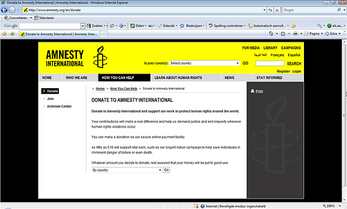
On the site of Amnesty International it’s very clear which main and sub-category of the navigation the user is in.
5. Title tag
Another small but not unimportant element that can help users determine where they are on a website is the title tag. But thanks to our 8 tips for the perfect title tag you already know everything about that.

Excellent ways to indicate, fully agreed.
what is have experienced most is that when you allow users to access the page by clicking right column sub-menu, designer missed the point to highlight that selected item many a times.
Specially some of CMS system have very bad user experience on this regards, and users gets confused after clicking some links from the left pan and have to read breadcrumb or page titles.
Regards
http://wwww.usersmind.net
Nice blog Els!
Tips that seem so obvious when reading one by one! Having them altogether in a clear article is … luxury!
Best regards,
Kristiaan
Thanks, Kristiaan!
You’re very right. They’re all really obvious tips. But sometimes it’s good to be reminded of the basics. 🙂
Thanks Els…….
Nice Basic UX tips.