In cxpartners’ article ‘The myth of the page fold: evidence from user testing’ it’s suggested you don’t need to take the page fold into account when designing a page. Because users have no problem scrolling.
We don’t think things are as black and white as all that. Yes, contrary to what you’re used from us: a bit of nuance!
Table of contents
What is the page fold?
The term page fold is used for the imaginary line between the part of the page you can see without scrolling and the part of the page you can see when you scroll down.
Traditionally, the fold is considered to be on 570 or so pixels from the top edge of the page. That’s more or less what people see on their screens in a resolution of 1024×768.
Now, recent figures on screen resolutions in Belgium show that 70% of the people use a higher resolution. So really, you need to take into account multiple folds on 1 page.
Do or don’t people scroll?
It depends. What does it depend on? The type of page and the type of website.
1. Homepages and overview pages
A. News websites
On news websites, page length doesn’t matter much. Most people visit a news website to get updated on the latest news. They prefer a long page, with not just headlines but also summaries of the main stories, to a shorter page with just the headlines.
Scrolling down the long page is a lot faster than having to scan and click on individual headlines for more information. When it comes to the homepage and overview pages of news websites, we’d even be inclined to say: the longer, the better.
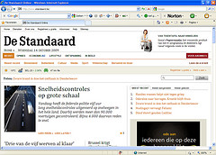

News websites don’t have to worry about the length of their homepage and overview pages.
B. Big, well-known online stores
Big online stores that sell thousands of products ánd that are known to the general public, like Amazon and Neckermann, can afford to have long homepages and overview pages. Most people who visit these sites know what to expect.
Their surfing behaviour roughly falls into 2 categories:
- Searchers
People who know what they’re looking for (e.g.: Alice Munro’s ‘The beggar maid’) will very likely use the search feature or click on the category of their choice. They don’t care about the rest of the homepage. - Browsers
Browsers can be both bargain hunters or people who are looking for something but they don’t know exactly what just yet (e.g. some light reading for the beach). They will have a look around on the homepage and overview pages that interest them (like the overview page on ‘thrillers’).
Note: we’re saying big webshops can afford to have long homepages and overview pages. They don’t have to have them.
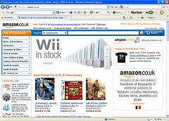
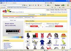
Amazon pretty much ignores the page fold. eBay makes an effort to put as much useful information above the page fold as possible.
C. Regular company or organisation
On the homepage of a regular company or government organisation people prefer not to scroll. That’s what they spontaneously say during user tests. It also shows in their surfing behaviour and it’s backed up by logfile analysis. (Use the ‘site overlay’ feature in your Google Analytics account.)
People expect on the homepage of a ‘regular’ company that important information is visible without scrolling. It makes sense for them to expect that. They’re on those websites to do something. And they’d like to do that as quickly as possible. The top tasks people use the site for should be immediately visible.
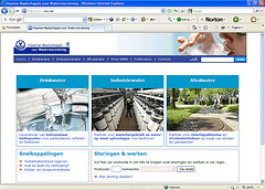
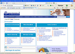
VMW tries very hard to put all the important info above the page fold, both on the homepage and on the overview pages.
Can’t you put anything below the page fold?
Sure you can. Most people surf in higher screen resolutions than 1024 x 768 anyway.
And of course some people will scroll. Just don’t assume all of them will.
Put the really important stuff, your visitors’ top tasks, above the page fold. Lower down on the page you can put less important items like news, events, etc.
How can you encourage people to scroll?
Avoid page-wide ads or empty areas near the page fold. Make clear the page doesn’t end there. Show a little of the content that’s below the page fold. That encourages people to scroll.

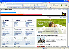
Vlerick and Belgium.be put their most important links above the page fold. Because people can see the headings of the info below the page fold a number of people will scroll on these pages.
2. Detail pages
On detail pages length doesn’t really matter. People will scroll just as long as you keep them interested. But just because people scroll doesn’t mean you can do whatever you like on a detail page.
Again, make clear what the page has to offer above the page fold. There are different ways to do that, depending on the type of page.
A. Product pages
- Executive summary
A short summary of the most important information at the top of the page. Amazon’s product pages are a good example. You can immediately see the product’s name, picture, price and whether or not it’s in stock.

- Tabs
Tabs, or more precisely in-page tabs, are interesting if you have a lot of information about a product (i.e.: product description, technical specifiactions, references). Tabs are best used in combination with an executive summary. Like on KeepYourCooler.com.

B. Content pages
- Jump links or anchor links
A clickable table of contents at the top of the page. The long detail pages of the province of Flemish Brabant are a good example. Read our article on anchor links for a more detailed explanation.
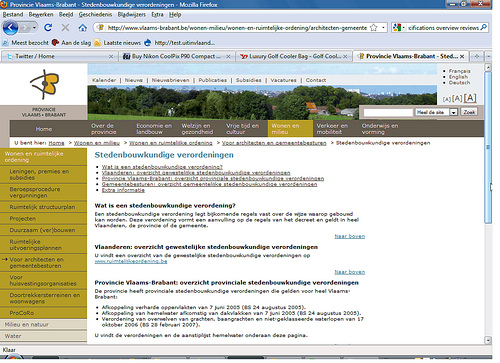
Just a reminder: also on detail pages you should always make clear the page doesn’t end at the page fold. Give a hint of the content below the page fold.
User testing is important, but it can’t tell you everything
The conclusions of cxpartners’ article about the page fold seem to be entirely based on user testing.
Now, as you may or may not know, we are big advocates of user testing. But it is not the be-all and end-all of usability. User testing is qualitative research. It takes more than data from user testing to make a bold statement like ‘the page fold is a myth’.
You also need data from quantitative research, like logfile analysis. When you look at these figures, you’ll often see that links above the page fold are clicked 3 times as often as links below the page fold.
It’s important to know whether or not people scroll. But it’s not the only thing that matters.
How many people simply leave a page with little or no content above the page fold? What’s the conversion rate of pages like that?
Moral of the story
Is the page fold a myth? No, it isn’t. The page fold exists and affects people’s surfing behaviour.
Put important information at the top of the page and make sure people know the page doesn’t stop at the page fold.

nicely balanced article with nuance indeed. like this approach.
It’s pretty ridiculous to call something a myth when it provably exists. Load any long page, and you’ll have a fold. For example this very article: only the top part was initially visible even when viewed in a full-screen window on a 30-inch monitor.
The concept of the fold simply says that some parts of a long page will be initially visible whereas other parts will only become visible after some action on the part of the user (i.e., to scroll). And depending on how much the user scrolls, more or less of the initially invisible part may be revealed.
As you say, there’s plenty of empirical evidence that users sometimes scroll and sometimes don’t. But the key point is that the decision as to whether to reveal more logically has to be made *before* the user takes the step to view the additional parts of the page. This again means that the initially-viewable part of the page has to provide sufficient information scent to convince the user to take this step.
In other words, what’s above the fold impacts the decision whether to view what’s below the fold.
(For a first-time visit. On subsequent visits, the user *may* remember lower parts of the page from previous visits. But note the table on page 47 of “Prioritizing Web Usability” showing that users scroll much less on later visits than during first visits to a given page.)
(Impressed Jakob is reading this)
Anyway, there’s also a lot of discussion going on about this topic at 2 threads we’ve started on the topic in these LinkedIn Groups:
– User Experience Group
– User Experience Professionals Network
The page fold is most definitely a ‘myth’ if it is used as a direct analogue to the newspaper (front) page fold, which it often is.
There’s absolutely no point in cramming everything into the top 550 pixels of a page. Yet this is what happens when marketing managers, product managers and misguided designers start to assume that it’s as hard to scroll down on a web page than to look at the lower half of the front page of a newspaper on a newsstand.
That, and only that, is ‘the myth of the page fold’.
Nice article and I agree with Toon’s opinion.. When cramming everything in the top 550pixels, the page becomes also less “usable” because there’s too much clutter etc..
@Toon and @Tom: Where do you get the idea that we propose to cram everything above the page fold? All we’re saying is: the page fold is not a myth, it’s a reality. People will scroll but only if you give them good reason to. The content you put above the page fold has a lot to do with whether users scroll or not.
@Els Well, you started it by saying the page fold is *not* a myth 😉
It is a myth, in the sense that you can’t just transpose experience with newspaper design onto the web. People tend to do that too often, transposing ‘rules’ from other areas of graphic design onto the web. Sometimes, a powerful and sensationalist headline is needed to wake everybody up, even if it isn’t 100% correct.
To summarise: I’d suggest to use analogies from other design areas very cautiously. Confusion arises easily, and before you know it a myth is born.
@Toon The page fold is not a myth. You might not like the name page fold because it reminds you too much of paper. Fine by me. Let’s call it scroll line. Heck, let’s call it Sandy. The point is: it exists.
I’m not trying to transpose experience with newspaper design onto the web. There is a certain line on a web page (Did I say page? Damn, that sounds like paper too!) below which people don’t see the content unless they scroll. This is a fact.
As for the headline: ‘The Myth of the Page Fold’? I personally think it was a poor choice. Sure, headlines can be thought-provoking. But they should never be downright misleading.
It’s possible even for a big company to go too far. I think Amazon is cramming way too much into their detail pages – I have trouble finding the information and reviews for the book I’m looking at.
I notice two extremes in smaller sites. Some fill the top half with pretty graphics, and some fill the screen with multiple columns of information. I’m annoyed by both! I want to see information immediately, but not more than two columns. It’s hard to track between multiple columns.
Page fold is do very important role in the designing. When we are focusing on the main content, that holds the user for a time. But when it’s coming to the new technology like web 2.0+, i consider that page fold is not required.
I agree with the Jakob Nielsen comments.
(For a first-time visit. On subsequent visits, the user *may* remember lower parts of the page from previous visits. But note the table on page 47 of “Prioritizing Web Usability” showing that users scroll much less on later visits than during first visits to a given page.)
very interesting article about web usability. To be honest I don’t remember in the last months to get so much into this mood of reading a blog article from A to Z.
for me this article is clear about one thing, the important things should be in that 5XXpx, how can we know what is important and what isn’t?
@ken Through user research. Because experts don’t know everything, not even usability experts: http://webusability-blog.co…
> In other words, what’s above the fold impacts the decision whether to view what’s below the fold.
No, that’s not true. Many people will visit a site knowing, before having seen *any* of its content, that they will scroll. Example: visiting any blog which typically has good comment threads. Another example: GOOG search.
It’s also misleading to characterizing scrolling as a decision as a decision; it’s not a decision, it’s an instinctual reaction.
@ Rowan
On what research are your assumptions based?
1. Even on a blog the content that’s visible without scrolling has a big influence. We recently did a lot of testing around this topic. When a blog article sttarts with some kind of bulleted list or executive summary, more people will scroll and reac the end of the article.
2. Look at any eyetraking research of Google result pages and you’ll see that the top 3 results account for 80% of the viewing.
So yes, the page fold exists. And the content above the fold will influance the incognitive decision wheater you’ll scroll or leave the page.
There is a lot of validity to communicating the purpose of the site and essential functionality above the fold, or scroll-line. I am also glad you emphasize not harming the usability of the site by cramming too much into there.
However, there is a gigantic confound in your data analysis that I’m a bit surprised you or Jakob haven’t touched on; the majority of web sites already cram the most relevant information above the fold or as close as possible as this has been widely accepted wisdom for a long time. So when you say something like “you’ll often see that links above the page fold are clicked 3 times as often as links below the page fold” you are making a blind assertion as to the reason for this without normalizing for the percentage of relative links above the fold as opposed to below it.
Additionally, when you mention that users spontaneously say they don’t want to scroll on a home page of a regular company can you please cite actual data backing this up? I do not doubt your sincerity but, well, anyone can say anything and without data backing it up it’s only so much wind.
Hi Dan,
Thanks for your input on this issue. I’m afraid I don’t really agree with you when you say most sites already put their most important information above the fold. I think there has definitely been some improvement since the time of publication of this article in 2009 but (at least in Belgium) even in 2012 we still see this is not the case.
I would even go so far as to say a lot of websites don’t know what their most important information really is. But that’s a different story entirely.
About the test users spontaneously saying they don’t like to scroll. This is just something that we noticed doing a lot of user testing. I’m afraid I don’t have any hard data on this one. So yeah: keep doubting. I promise to start keeping track of this so I can quantify it at some stage. 🙂