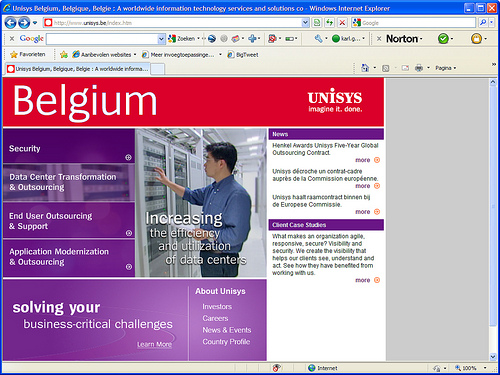
Question: what is wrong with the homepage of Unisys Belgium?

Answer: just about everything
As a screenshot the homepage doesn’t look all that bad. But when you really use the page you immediately notice all sorts of things going wrong.
- The attention grabbers (Security, Data Center Transformation & Outsourcing…) hardly do anything. Okay, the image on the right changes on mouse-over. But other than that: nothing, nada, zilch. You can’t even click them.
- There’s no other useful content on the homepage:
- The news and links to case studies are pretty typical homepage content. Even though user tests show that’s not what people want to see on a homepage.
- The links in the ‘About Unisys’ block (‘Careers’ excepted)are irrelevant for 99% of their visitors and not worth the space they’re taking up here.
- Where’s the main navigation? Is Unisys too cool to have something so traditional as a main navigation?
- Last but not least there’s the tagline ‘Solving your business-critical challenges’. A good line, but not exactly unique to the business Unisys is in. I can say that about my company. And you can probably say it about yours. It’s meaningless. And what’s more, the tagline itself isn’t clickable, only the ‘Learn more’ is.
Is it really all that bad?
Doh. If you have any doubts about the degree to which this homepage sucks, you should be banned from professionally dealing with websites for the rest of your life.
Movie
Just in case Unisys changes the homepage before you read this, here’s a little movie with the homepage and the page that appears when you click ‘Learn more’.

Leave a Reply