A lot of homepages are full to the point of overflowing with content. Most of the time, that’s not a good idea.
Then again, sometimes it’s the only way to go. For a newspaper website for example, a long homepage filled with content is the norm rather than the exception.
In other words, a long homepage isn’t always a cardinal sin. At least not when it looks orderly and structured.
Unfortunately, some websites look like they’ve been thrown together from a distance. The result: a mess without visual anchor points to steady and guide the visitor’s eye.
Horizontal lines are calming
There’s a simple thing that makes a page look a lot calmer: the horizontal line.
You can use an actual horizontal line or you can simply line up a number of page elements to an imaginary horizontal line.
Try it. It’ll make your page look less frantic.
Example: De Standaard
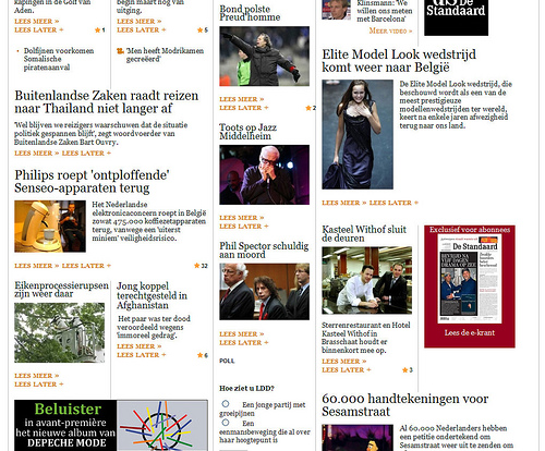
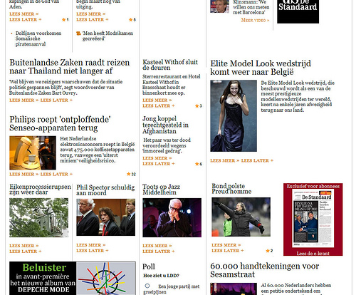
We tried it on the homepage of De Standaard, one of the leading Flemish newspapers.
The actual homepage of De Standaard

After our cut and paste work

4 things to keep in mind:
- We’re not designers.
- All we did is rearrange the existing elements.
- We didn’t change the number of vertical columns.
- We did it in 5 minutes.
What do you think?
Can you tell the difference? Is it an improvement?
We’d love to hear from you.

Definitely for the better! That’s the align to baseline grid in Indesign! 😉