Everybody compares
Everybody who shops on the web compares. They don’t just compare products from different vendors, but also different products from the same vendor. This comparison behaviour goes for visitors of both b2c and b2b websites.
Allow users to compare
Comparing is a top task so make sure it’s easy to do on your website. If you make it hard to compare your products, there’s a good chance your website visitors will not become customers.
What do your visitors expect?
- Main characteristics of the product or service on the product page, pereferably as a bulleted list.
- An overview of the similarities and differences of comparable products on 1 page. It’s really annoying if you have to get out pen and paper to write down product characteristics and then look for the differences between the products.
What do you need in order to compare?
- Clearly differentiated products or services. If you’re not sure what the difference is between product A and B, how is your customer supposed to know?
- If you want to compare products in a meaningful way, you need to know what the deciding factors are for your customers. Seems easy, right? Wrong. In about half of the projects we do, the company doesn’t know what their customers deciding criteria are.
What if you don’t meet these criteria?
- Make sure you do!
The choice is simple: adapt or lose customers.
Less than 10 products or services to compare?
Basic principle: all on 1 page
A search feature or wizard is not needed here. Your users probably aren’t rocket scientists but they aren’t idiots either.
Option 1: table
- Users love this. If it’s in any way possible, try this.
- Recent tests show that putting the most expensive products first is the most effective.
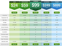
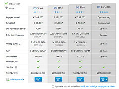


Top row: good examples by Shopify en Combell, lowest to highest price. Basecamp (bottom row) does slightly better: from highest to lowest price and with extra information on mouse-over.
Option 2: separate blocks
- Clear heading.
- Main characteristics in bullets, preferably in such a way that it’s easy to compare the different products or services (a.o. by the same order and approach).
- Price.
- Each block should be clickable in its entirety.
- Line up blocks horizontally whenever possible. That creates a better overview.
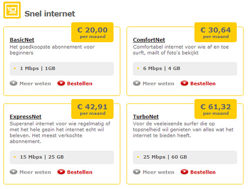
The blocks on the Telenet website offer a pretty good overview.
More than 10 products or services?
Facets
All products on 1 page with faceted search on the left.
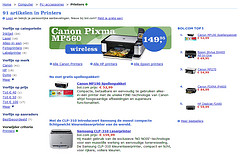
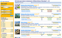
2 good examples of refining results by faceted search: Bol.com (left) en Booking.com (right)
7 things to keep in mind about faceted search
- Put the faceted search on the left. You can put it on the right, but less people will notice it. You can put it at the top of the page as well, but that will push the actual results down and that’s not ideal.
- Limit facets to the main product characteristics. Don’t cram every detail in there.
- Take your customers’ view on what the product’s main characteristics are. Remember: what you think, doesn’t matter. It’s all about your customers.
- Make selecting and deselecting the facets easy.
- It should be impossible for users to make a selection that delivers zero results.
- In many cases, it’s helpful if the user can order the results list (alphabetically, by price, by size, …).
- If there are more than 20 products in your list, it’s best to go for numbered results pages (cfr. Google).
Detailed comparison
A more detailed comparison, that sums up all characteristics of comparable products in a table can be very handy for certain products.

Other options?
Have you seen other good examples? Maybe you came up with one yourself? Feel free to share it in the reactions.

By using this I can comparison any product with another.