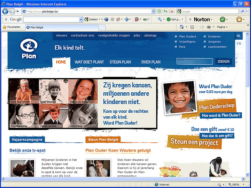
The website of Plan België, www.planbelgie.be, was awarded the jury prize for ‘Most user-friendly government or non-profit website’ at the Usability Awards 2009.
What’s so good about the Plan België website?
1. Creative and user-friendly
Because most websites of usability gurus can’t exactly be accused of looking sexy (Useit.com anyone? Or even yours truly?), a lot of people seem to think user-friendly is synonymous with dull.
Plan België proves these people wrong.

Jury comments:
- Graphically creative without losing sight of user-friendliness
- Infectious design
- Good looking website that does what it’s supposed to do
2. Good categorization and navigation
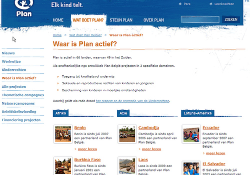
The main navigation (‘What Plan does’, ‘Support Plan’, ‘About Plan’) is short and clear. The second level of navigation is also pretty good. The overview pages make the most of the clear categorization.

3. Focus on top tasks
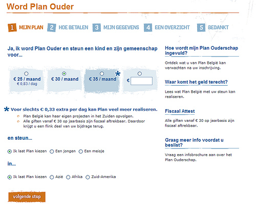
The website’s top tasks (‘Become a Plan parent’ and ‘Donate’) are in the picture the whole time. The website is built around these tasks.

4. Well-written, layered content
Fortunately, the website is more than one big cry of ‘show me the money’. It has loads of interesting content. Two things stand out:
- The content is ‘layered’. It’s presented to the visitor one tantalizing bit at a time. Instead of in one big gulp.
- The writing is adapted to the web. Short and sweet.

Is planbelgie.be perfect?
Do pigs fly? A few critical notes from the jury:
- The website’s look & feel is pretty busy-looking. Not overly so but because of the excess of cross-links on the right side of some pages it can get too busy. Focus: the basis of every good website
- The breadcrumb isn’t exactly ideal. Read our 7 tips for a good breadcrumb
- Search results could be a lot better, especially the way they’re presented. Read our layout tips for search results

Leave a Reply