Google Maps is a wonderful thing. But, as is often the case with wonderful things, it isn’t always used in the best of ways.
People seem to put stuff on Google Maps pretty much without thinking about it.
Some examples from travel websites.
Google Maps: how not to use it
Example 1: airline
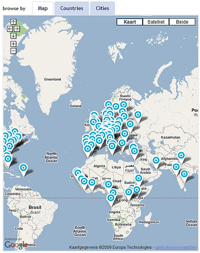
“The map gives you an overview of all our destinations. You can choose where to go with a single click.” Great, isn’t it?
No, it isn’t. You can see the airline is very active in Europe. And that they haven’t discovered South-America yet.
Picking your destination in one easy click? I don’t think so.
Example 2: travel site specialised in London
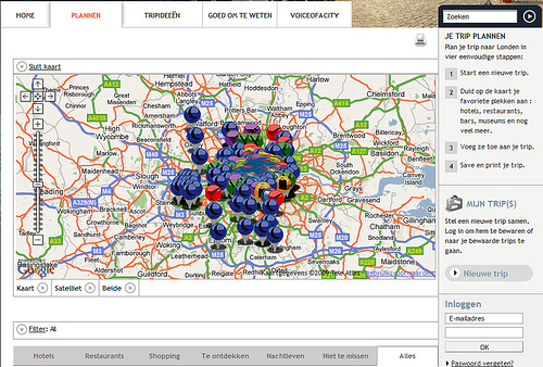
Hello? Is anybody there? What were they thinking? And what do those colour differences mean? Is there some universal colour code I’m unaware of?
The user can zoom, can’t he?
Yes, he can. He can also stand on his head to look at your website. Does that mean you can put all your pages upside down?
Theoretically, yes, you can zoom. But a lot of people aren’t really good at zooming.
Seriously, if you’re ever bored during user testing, have the test user zoom in and out on a map and scroll sideways. Fun guaranteed.
Besides, most users who see this kind of overload of dots on a map won’t even bother to zoom. They’ll just leave.
How to use Google Maps the right way
The examples below are from a Belgian travel agency specialized in Australia. Instead of 1 map of Australia with 70.000 dots on it, they use the maps in 3 steps.
- Which state are you interested in visiting and what are the highlights there?
- In that state, what are the highlights per region?
- Show me everything the region has to offer.
Step 1
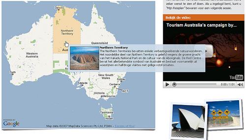
Step 2
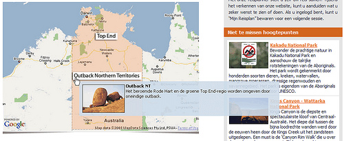
Step 3
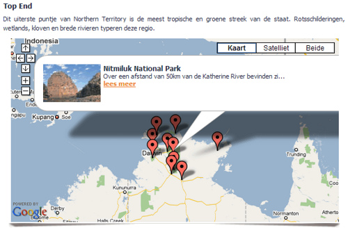
What’s good about this example?
There are more steps. But the steps are clear and it’s faster than zooming. And above all: the steps offer the user context. They take out the guesswork and allow him to make choices based on information.
Sure, the first two overlays aren’t ideal. But hey, no website’s perfect.
Got some Google Maps examples of your own?
Feel free to post your own good and bad examples of Google Maps in the comments.

CHeck out the website of Airberlin – http://www.airberlin.com and the way there use map’s, oké the maps are no google maps but look at the way there used them.
One of the most amazing uses of google maps that I’ve seen on a travel/tourist related site is the Ride Oregon Trails site. It very smartly overlays google functionality with a very well thought out and presented flash layer.
http://rideoregonride.com/t…
@Thomas: Interesting. Not sure about those flight routes though…
@Ben: Looks good and is easy to use. Thanks for sharing!
I had some problems with Google maps. Some travel agents add our hotel in wrong location and when we tryed correct all these wrong information Google made about 1 month to be sure that we are the owners. This happen because Google need authorize that we are the owners first via phone (but hotel is closed all winter period) and after via letter but this take alot of time. Think now if your property is about 6 times in wrong location!!
I think is better Google before add any property in Google map to make pre-authorization.