How do we at AGConsult tackle the 2 things that annoy us most about in-person user testing? And how do we get quick feedback from lots of users while working on information architecture and mock-ups? The answer is simple: we use first-click testing or screenshot testing.
2 of the most annoying things about user tests
Moderated user tests in person are one of my favorite methods for usability research.
But user testing can also be frustrating.
The 2 things I find most annoying:
- You often see that virtually all users meet the same big obstacles. And because of these obstacles, we’re not getting to the heart of the issue. Smaller problems remain unnoticed.
- Sometimes testing with 5 or 6 people is not enough to base a big decision on.
User tests are expensive. And they’re not always the most efficient research method.
Sure, you can organize more testing days. But user testing is labor-intensive. And it’s not exactly cheap either.
That’s why we use several online testing tools as well.
One of our favorites is Chalkmark, a screenshot based click testing tool by Optimal Workshop.
The 3 main things you can find out with screenshot testing:
- Do people click where they should click to complete the task?
- Are there any elements on the page that get in the way of task completion?
- How fast can people complete the task?
A click test provides feedback on things like:
- Effectiveness of your lay-out
- Is everything in the right place?
- Do users notice your action buttons?
- What is superfluous or confusing?
- Terminology
- Is the content of your navigation clear?
- Are you using the right terms in your links and action buttons?
- Structure
- Are your home and category pages aligned with your visitors’ top tasks?
- Are your filters clear on category pages?
What do you need for a screenshot test?
Creating a first-click test or screenshot test is super easy.
What you need: one or several images, a number of questions and test users.
- One or several images
Your image can be a screenshot, scan or picture of your wire-frame, mock-up or prototype. Or of your existing website. Or of your competitor’s website. - Questions
For each image, you can ask 1 or more questions. In your questions you describe typical tasks users do on the website. - Test users
In contrast to normal user tests, you don’t need to be physically near your test users. The test is online.
To get test users you need to invite them. You can do that through e-mail, social media or a message on your website.
How does screenshot testing work?
Your questions are displayed on the test user’s screen. The test user looks for the answers to your questions on the image you uploaded.
They then click on the area in the image where they’d expect to find the answer. Clicking through to another page, like on a real website, is not possible. It’s a screenshot. So they’re limited to just the first click.
As soon as the user has marked the answer to a question with a click, the next question is displayed.
Limit the number of questions to 5 for an optimal screenshot test response rate.
It’s up to you to decide how many questions to ask. From our experience 5 questions is best if you want your users to complete the test and answer all the questions. With more questions we’ve noticed many users quit before they reach the end of the test.
You can configure Chalkmark to show maximum 5 questions per test user, even if you’ve prepared more questions. In the same order or randomly, that’s up to you to decide.
At the end of the test session you can ask your users more questions. Such as general feedback on what they have seen. Or socio-demographic data.
You can use those results to filter the answers depending on the user criteria you’re interested in. For example: all women between 25 and 45 years. Or clients versus non-clients.
The result? Heat maps with click rates
Once the survey is completed, the test results are displayed on heat maps. You can see exactly how many people clicked where.
That’s one of the things that are great about first-click testing: it really gives you results at a single glance.
2 examples of what we learned from screenshot testing for Muntpunt
Muntpunt, a library and information center in Brussels, asked us to create the structure and mock-ups for their new website.
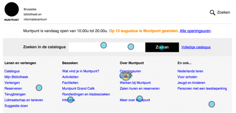
1. Confusing search features
Question: You want to file a complaint.

As you notice on the heat map, lots of test users clicked on ‘Contact’. Great, because that’s where the complaint section is!
But we saw something else too. People who wanted to search clicked on the central search box (search the library catalogue). They didn’t click on the overall search feature at the top right of the page (search the website).
This told us it was not clear to users the 2 search features had different functions. To solve this we changed the wording of the catalogue search feature’s button to ‘Search the catalogue’.

2. The same problem, different solutions
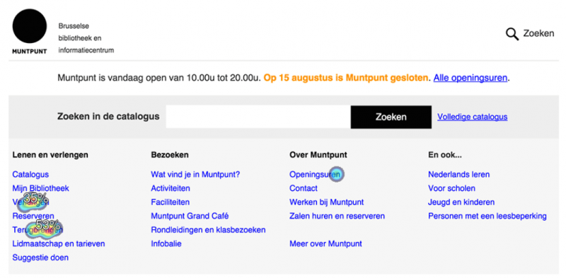
Question: You need to return your books today but Muntpunt is already closed. Now what?
This is one of the most frequent questions people ask Muntpunt. They have a collecting point to return books after opening hours, but that’s not well-known.

The result: most test users clicked on ‘Return’, which was what we were hoping for. On that page, we tell them about the special after-hours return box.
But something else happened that we were not expecting: lots of people clicked on ‘Renew. Which is of course not wrong. These people just found another solution to their problem: renewing the books online instead of returning them.
More than just telling you where people click, screenshot testing can also help you learn more about how they think.
Limitations of usability research with first-click testing
- You can’t test the whole website and website flow the same way you can do with in-person user tests or moderated remote tests.
- Only the first click is visible because you test on single pages. That 1st click is nevertheless crucial. Studies show people who were right with the 1st click reach their goals 3 x as often as those who clicked on a wrong link.
- Chalkmark is not compatible with dynamic content, like menus that show or hide on mouse-over.
- As always with unmoderated usability testing tools, you can’t really know what users are thinking.
Advantages of click testing tools
- Gather quick and relatively cheap feedback from people in your target audience.
- You get feedback from lots of users in a short time span.
- Less time-intensive than traditional user testing methods.
- Ideal to discover (and resolve) big problems before you get started with user tests.
- In short: it’s a qualitative method that lets you reach a large audience.. What more could you want?
Be aware: preparation is important
As always with user tests, a lot depends on which questions you ask and how you verbalize them. Tools are a helpful resource, but the way you use them is crucial.
Just because you bought an expensive camera doesn’t mean you’ll automatically take a great picture.

Leave a Reply