Brussels Airlines is the public vote winner of the first Belgian Usability Awards.
What’s so good about the Brussels Airlines website?
1. Task-oriented homepage
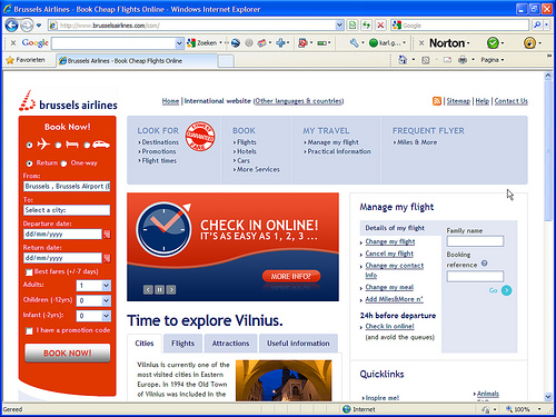
If you’ve been here before, or read Gerry McGovern’s column, you know it’s important to identify and manage the users’ top tasks, the main reasons why they visit your website.
Brussels Airlines knows that. And both the professional jury and the public appreciate it.
Jury comments:
- “Task-oriented homepage. The majority of visitors come to look for a flight, book a flight or look up details of a flight they’ve booked earlier.”
- “Good sectioning off of the different reasons people visit the website for.”
- “You can start booking on the homepage.”
- “Clear homepage.”

More good things about the homepage:
- The navigation is aimed at the important stuff. Things 99% of the visitors are looking for. The odd user wanting to know more about the history of Brussels Airlines is going to have to try a bit harder to find that information.
- ‘Book now’ is very prominent on the homepage. And that’s good. It’s what most people visit the website for.
- ‘Manage my flight’ is important for 2 reasons:
- Direct access to these top tasks. Especially ‘Check in online’.
- Inspire confidence. It’s good to see things like ‘Change my flight’ and ‘Cancel my flight’ are easy to find when you’re about to book a flight.
2. Inspire me!
The big disadvantage of most booking systems or travel search engines is their database-approach. The result of that is a block like ‘Book now’ on the homepage.
Great if you want to book a flight to Melbourne from November 15 till December 16. Not so great if you’re simply tired of winter and looking for any destination where it’s sunny and warm.
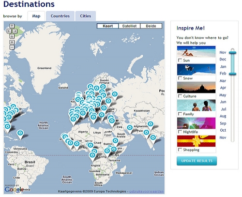
On the ‘Destinations’ page Brussels Airlines tries to go beyond the classical database-approach. Pick a theme and a time period and they give you a list of destinations that fulfill your wish. Nice.

3. Practical overview of the practical information
Okay then, I’ll say it one more time: it’s practical.

4. Book a flight
The ‘Book now!’ block on the homepage scored the site points with all jury members.
The type-in fields and the date-picker are well-executed.
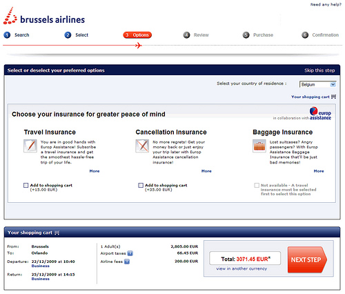
The division into logical steps was appreciated as well: “the wizard-like approach helps present a complex procedure in a simple way”.

Does Brussels Airlines have the perfect website?
Is it raining men? There’s no such thing as the perfect website. The Brussels Airlines website is good, but of course there are points of improvement as well.
Jury comments:
- “The copywriting is often very good, especially on destination pages. But the pages with practical information can be long-winded and not very visually appealling.”
- “Booking online works well, but it could be better still. It’s often unclear why there are price differences in the same class (economy or business). The error messages can be improved as well.”
- “The map showing all destinations isn’t ideal.” Read our article ‘Google Maps: cases from travel websites’ for more information.

Hello,
I will be please to recevie the file (jpeg) of the destinations map of Brussels airlines, because its website is not able to make it.
Thanks you.
I would like to see a screen shot of the old website. Can you eithe rpost it here or send it across in an email?
REgards
Monica
Since two days the booking engine isn’t working on brusselsairlines.com. There seems to be a problem with validating the return date field.
“There was an error processing your request. Please try again.”