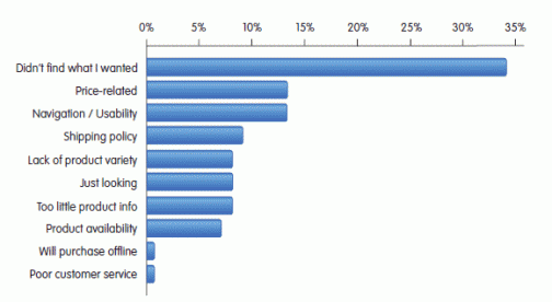
iPerceptions recently published its ‘Retail/E-Commerce Industry Report Q2 2009’. The figures are based on the feedback of 360.000 visitors of various e-commerce websites.
2 things in the report caught my eye.
1. Why didn’t you buy anything on this website?

Obviously I find it a little disappointing that ‘usability’ is only in 3rd place (13%). In my experience, not just as a usability consultant but as a surfer, it should be in 1st place.
Wait a second… Lack of usability ís 1st.
Let me explain:
- Of the 34% of people who answered ‘didn’t find what I wanted’, at least half (17%) can be attributed to usability problems. User tests show that at least half of the time the product or information the user is looking for is actually on the site but the user simply can’t find. Some reasons are:
- The product isn’t where the user expects it to be.
- The search feature doesn’t deliver the expected results.
- The product page is unclear or doesn’t contain enough information.
- 13% has problems with navigation or usability.
- 9% doesn’t buy because of the shipping policy. Which is a usability issue as well. Or did you think usability stops when you start talking about the real world?
- 8% can’t find enough product information. Yep, that too is a usability issue.
- 1% declines to buy because of bad customer service. Again, that’s usability.
The total: 17% + 13% + 9% + 8% + 1% = 48%
2. Task completion and customer satisfaction on e-commerce websites

There are 2 very interesting statistics here:
- Only 39,1% of the visitors of an e-commerce website visits with the intention to buy.
- 21,9% is just shopping around (‘Shop’) and 17,2% is there with a very specific purchase in mind (‘Buy’). (21,9% + 17,2% = 39,1%).
- 38,6% isn’t there to buy but to gather information.
- 13,9% apparently visits the site because they’re having trouble with a previous purchase.
- 38,5% of the people who visit the site with the intention to buy, do not succeed in doing so.
- 85,2% of the information gatherers manage to find what they want. That’s great.
- But as soon as somebody really wants to buy something, that number drops to 61,5%. In other words: 38,5% of the people who visit your site with the intention to buy do not succeed. Out of every potential 10.000 euros revenue you lose 3.850 euros due to bad usability.
Is usability advice a worthwhile investment?
Hell yes.

Please see my comments below in the spirit I am giving them – not out of a need to pick a fight, but a deep concern for how these numbers are being interpreted.
So, wow, this study is *deeply* flawed. Where to begin on those survey responses…
* Overlapping answers – navigation and usability can both be true at the same time, they’re not mutually exclusive answers
* How many respondents will know what “usability” means?
* On that note – what does “usability / navigation” mean? Usability is about so much more than navigation.
I can’t figure out the question was multiple select or single select. But it *should* be multiple select because more than 1 thing at the same time can be true.
Which brings me to my last point… you can’t just add these up and come up with a 48% number. You’re combining unrelated studies (“at least half”) and taking that arbitrary number and adding it to other numbers that all fall within the “usability” bucket. The responses are at different levels of specificity.
I agree with you that many of those answers are related to usability. But I think instead of massaging the statistics, what we should do is tell iPerceptions to redo the study and do it right.
The first question seems to be ambiguous in that “didn’t find what I wanted” could mean:
1. I didn’t find the *exact* product I wanted, or;
2. I didn’t find the product on the website *because the website is too difficult to use*.
So, which is it?
A little bit strange interpretation of numbers, I feel. Shipping policy as a usability issue? Or bad customer service?
“Usability” is not the same as “user experience”…
If the shipping policy is not clear, it is a usability issue.
We don’t like the word ‘user experience’. If a website opens with a 10 minute Flash intro, you can call that a ‘user experience’ too. But it’s a bad one.
We believe that everything that has to do with the user experience, should be a concern of the usability expert. Limiting usability to the interface is stupid.